This five-bedroom, six bathroom home in Studio City, California, was a new Cape Cod-style construction, bought off plan complete with standard issue lighting, fixtures and fittings.
Its new owner, however, wanted to make it her own and introduce more interest, unique features and personality. Above all, she wanted to add happiness to her new home, with texture and natural elements, and called on the expertise of an interior designer to do exactly that. The result of the home’s major redesign truly makes it one of the world’s best homes – spacious, bright and full of clever design solutions.
The interior designer who brought about the transformation is Jessica Nicastro, of Jessica Nicostro Design (opens in new tab), who worked closely with the homeowner to come up with the home’s new look. ‘We came in to de-spec the home,’ explains Jessica. ‘We swapped out lighting, all furnishings, and added custom built-ins, and beautiful custom roman clay to add visual interest. We wanted to give vibrancy to the home that has an open-floor plan with lots of white walls. And we wanted each space to feel special.’
Kitchen
(Image credit: Madeline Tolle)
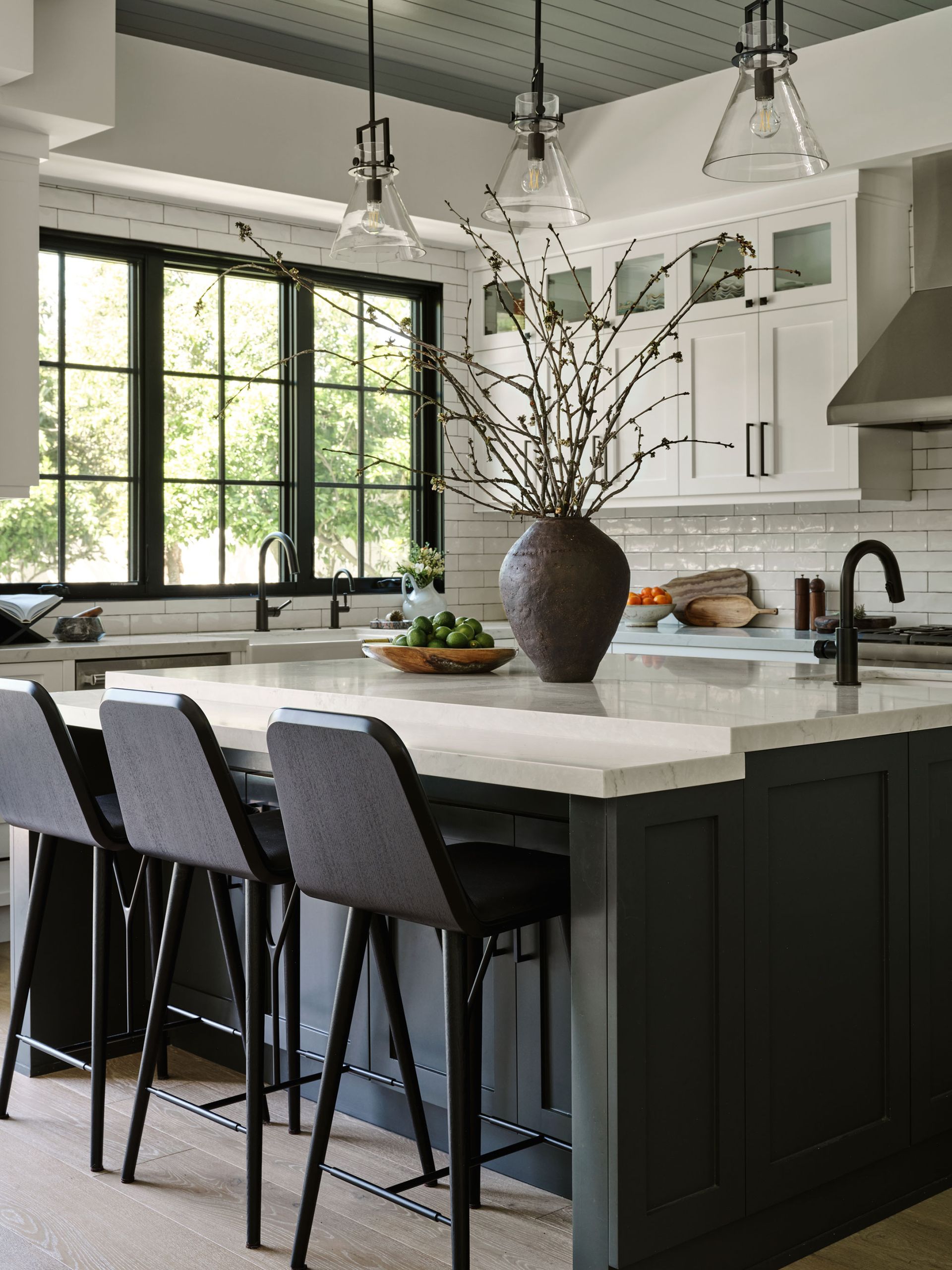
At the heart of the home’s open floor plan is the smartly refitted kitchen. Jessica’s kitchen ideas included dark gray base unit cabinetry and an island unit, topped with bright white quartz worktops, and white wall cupboards on the room’s back wall. Black faucets and bar stools reflect the graphic steel-framed windows.
(Image credit: Madeline Tolle)
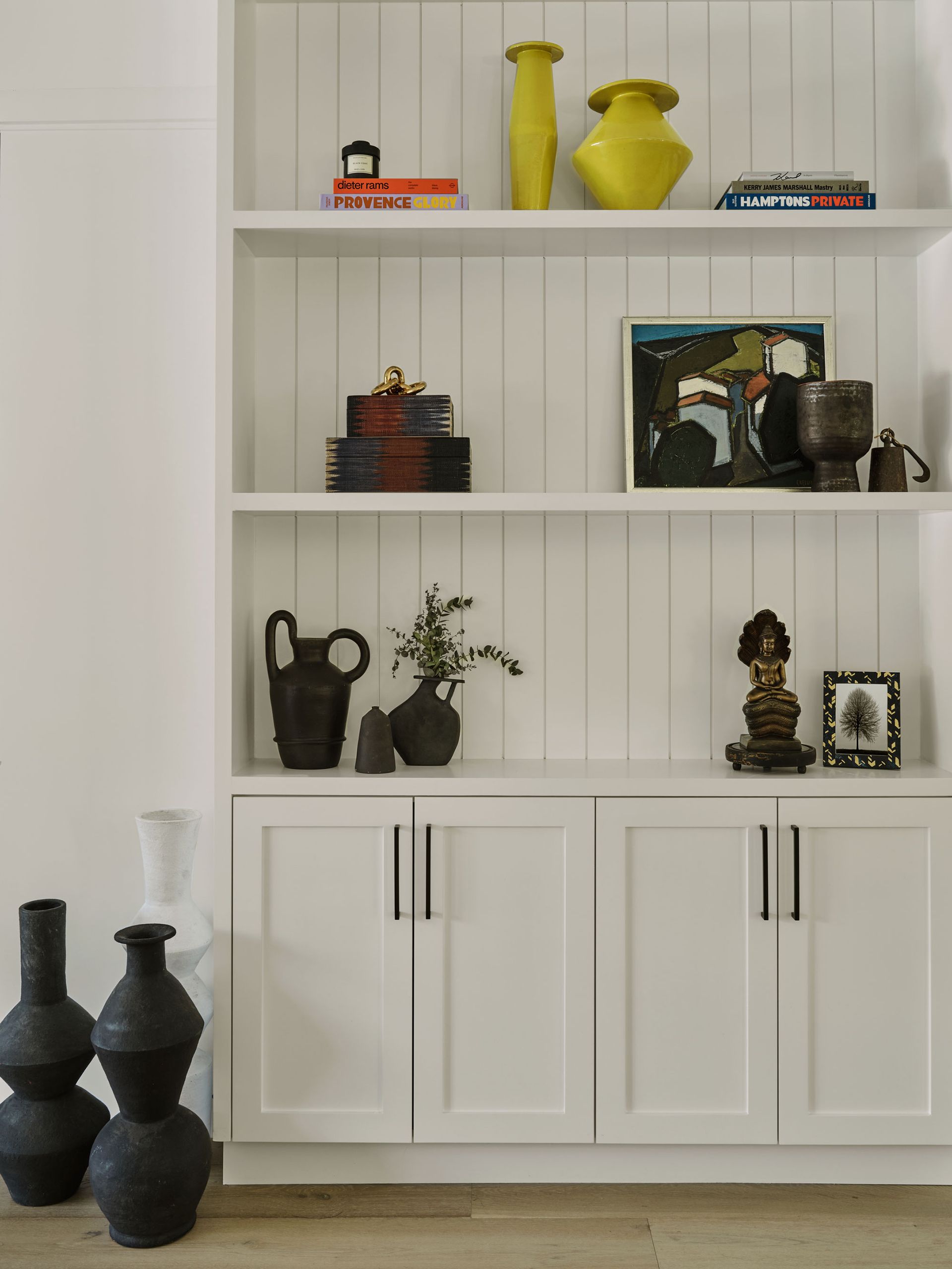
Custom-built cabinetry provides extra storage between the kitchen and formal dining room. The shelves are backed with paneled wood, echoing the paneling used elsewhere in the home. Jessica used bespoke built-in additions like this to move the house on from its newly constructed state.
living room
(Image credit: Madeline Tolle)
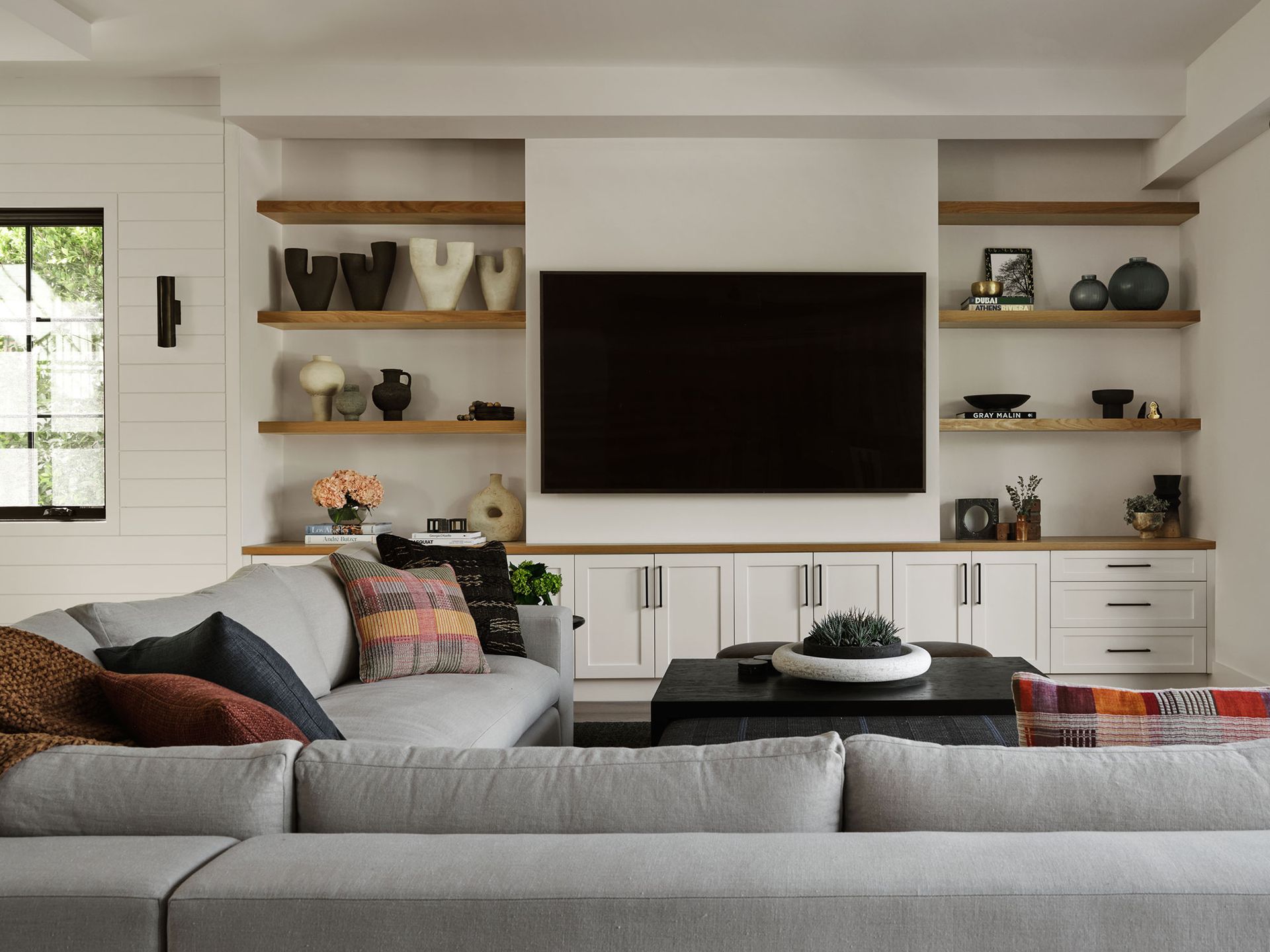
Living room ideas revolved around the room’s huge TV. ‘The client is a huge movie watcher so they wanted something functional and comfortable to put their feet up,’ says designer Jessica.
A huge multi-seater sectional was the answer here, along with a custom coffee table/ottoman. Again, bespoke cabinetry provides storage for games and display shelves for family treasures. All these elements introduce the happiness factor the client had asked Jessica to bring to the home.
dining room
(Image credit: Madeline Tolle)
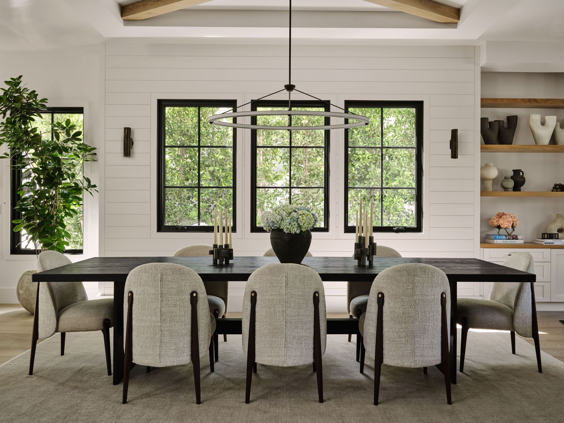
Jessica is delighted with the way her dining room ideas came together, and this is now her favorite room. ‘The scale of the lighting in the room with the simplicity of the table and curves of the chairs makes the new construction look personalized,’ she says. ‘The oval light fixture in the dining room was chosen to break up the horizontal shiplap on the far wall and layering vertical sconces,’ she adds.
Guest bedroom
(Image credit: Madeline Tolle)
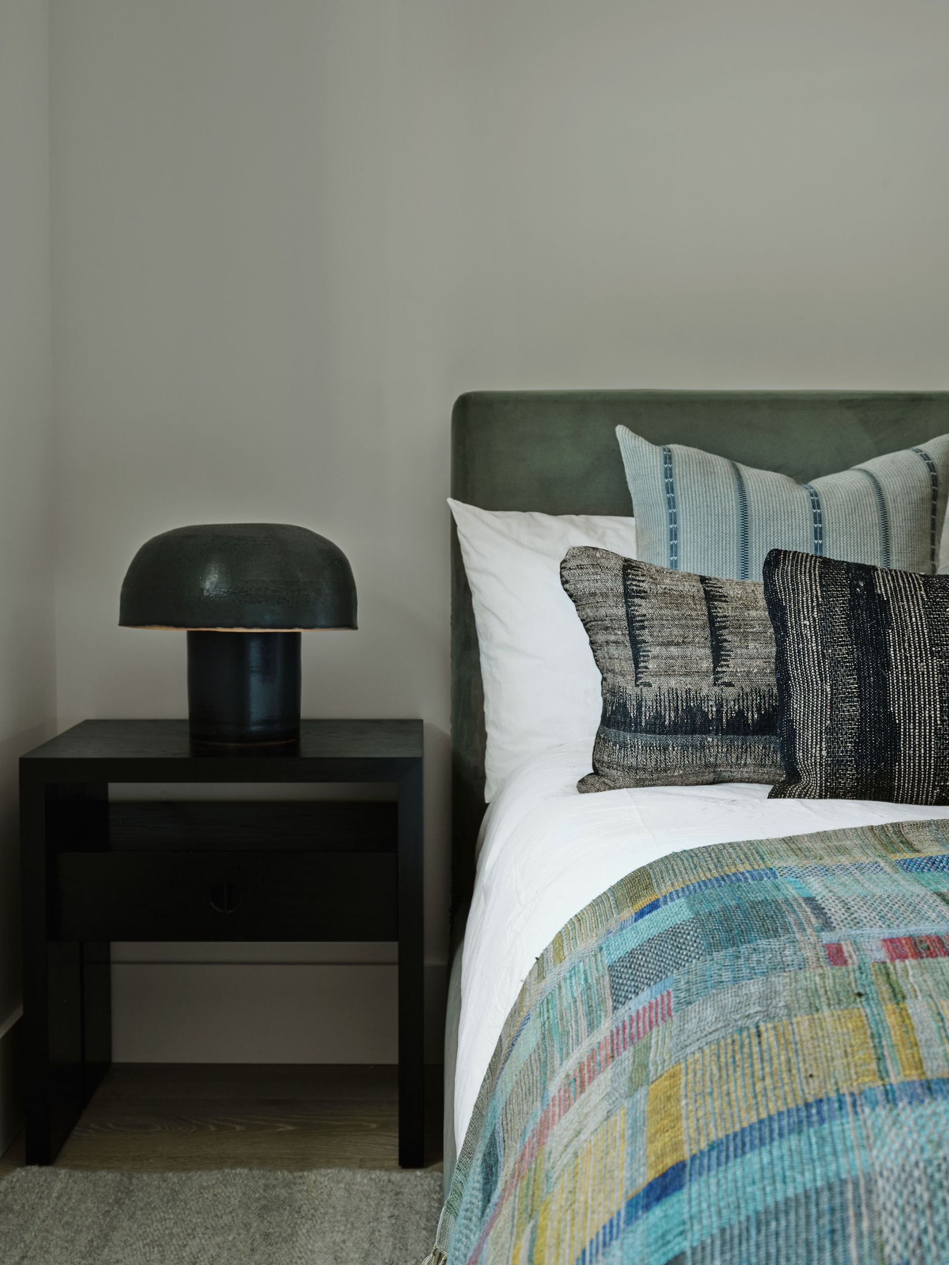
The guest room’s darker palette lends itself to multiple layers of textures and colors. Bedroom ideas here are simple but effective, and the look can easily be changed or refreshed with new pillows and throws in alternative shades to give a different mood against the neutral walls and basic pieces of furniture.
Primary bedroom
(Image credit: Madeline Tolle)
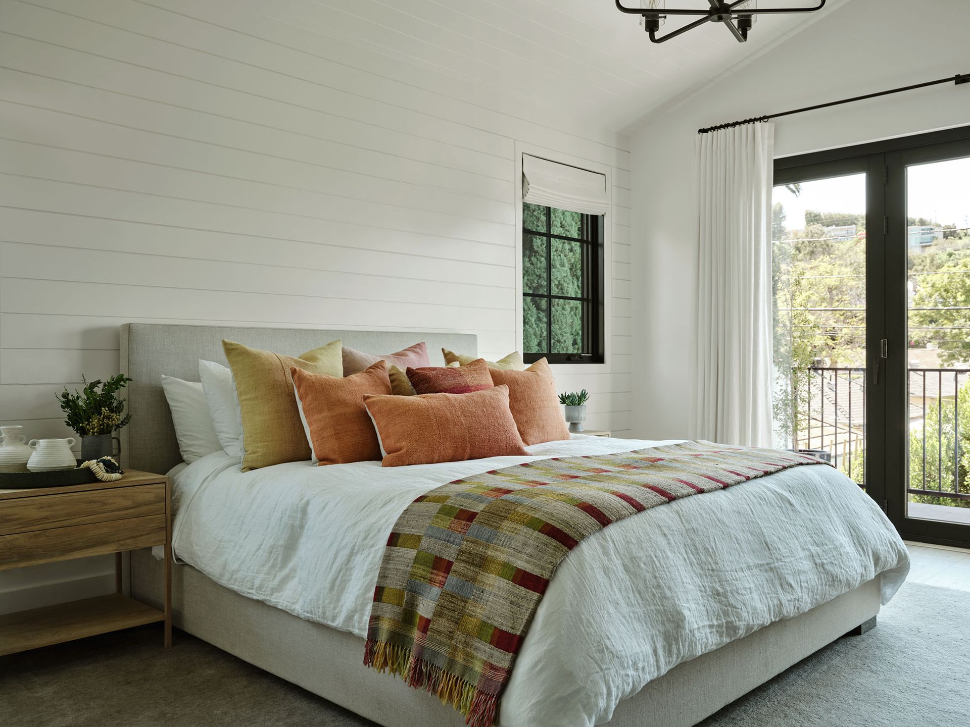
Spacious, bright and with a high ceiling, the primary bedroom was already an attractive space, with its glass doors to a balcony. As in the guest room, the basics are neutral, with shiplap paneling kept to a soft white. Color is introduced with blankets and pillow in peachy-apricot tones.
Primary en suite
(Image credit: Madeline Tolle)
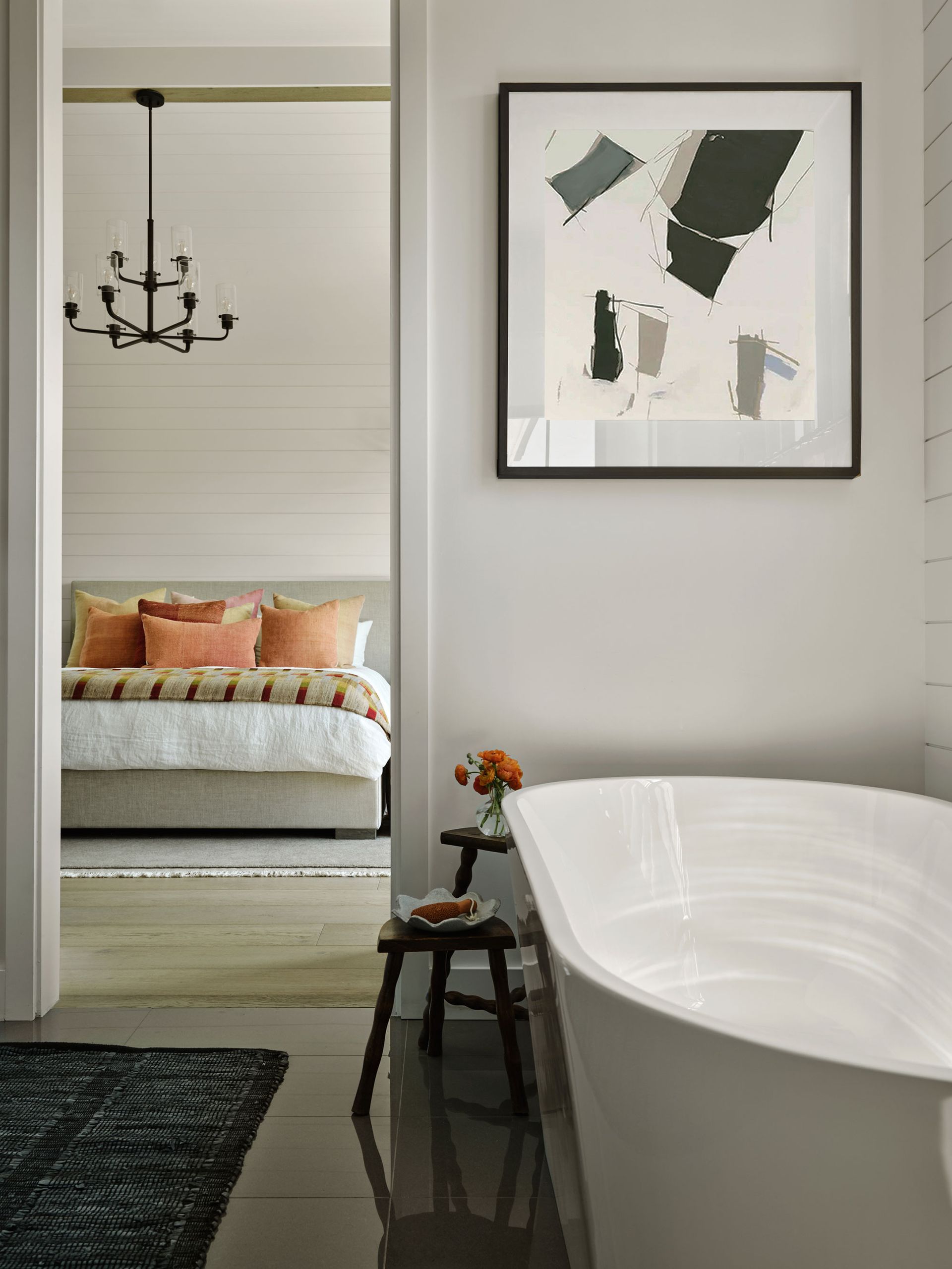
Bathroom ideas for the primary ensuite started with the unusual leaf-shaped freestanding bath tub. Clean lined and contemporary, the room is personalized with a striking modern art print and a dark rug on the polished marble flooring.
Jessica and her client are thrilled with the whole house redesign. ‘It really shows how texture, color, layers and textiles can set a new-build apart and give it character and a ton of personality,’ says Jessica.
Interior Designs: Jessica Nicostro Design
Photos: Madeline Tolle (opens in new tab)
Styling: William Graper